Grid system
Use our powerful mobile-first flexbox grid to build layouts of all shapes and sizes thanks to a twelve column system, six default responsive tiers, Sass variables and mixins, and dozens of predefined classes.
Example
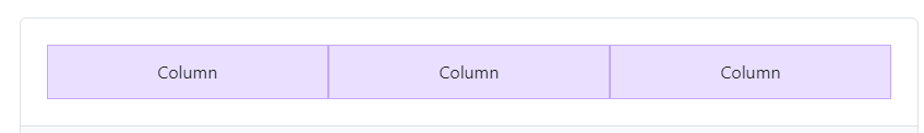
The above example creates three equal-width columns across all devices and viewports using our predefined grid classes. Those columns are centered in the page with the parent .container.
Auto-layout columns
Utilize breakpoint-specific column classes for easy column sizing without an explicit numbered class like .col-sm-6.

Setting one column width
Auto-layout for flexbox grid columns also means you can set the width of one column and have the sibling columns automatically resize around it. You may use predefined grid classes (as shown below), grid mixins, or inline widths. Note that the other columns will resize no matter the width of the center column.

Variable width content
Use col-{breakpoint}-auto classes to size columns based on the natural width of their content.

Responsive classes
Bootstrap’s grid includes six tiers of predefined classes for building complex responsive layouts. Customize the size of your columns on extra small, small, medium, large, or extra large devices however you see fit.
>All breakpoints
For grids that are the same from the smallest of devices to the largest, use the .col and .col-* classes. Specify a numbered class when you need a particularly sized column; otherwise, feel free to stick to .col.

Stacked to horizontal
Using a single set of .col-sm-* classes, you can create a basic grid system that starts out stacked and becomes horizontal at the small breakpoint (sm).

Mix and match
Don’t want your columns to simply stack in some grid tiers? Use a combination of different classes for each tier as needed. See the example below for a better idea of how it all works.

Row columns
Use the responsive .row-cols-* classes to quickly set the number of columns that best render your content and layout. Whereas normal .col-* classes apply to the individual columns (e.g., .col-md-4), the row columns classes are set on the parent .row as a shortcut. With .row-cols-auto you can give the columns their natural width. Use these row columns classes to quickly create basic grid layouts or to control your card layouts.


You can also use the accompanying Sass mixin, row-cols():
Nesting
To nest your content with the default grid, add a new .row and set of .col-sm-* columns within an existing .col-sm-* column. Nested rows should include a set of columns that add up to 12 or fewer (it is not required that you use all 12 available columns).

CSS
When using Bootstrap’s source Sass files, you have the option of using Sass variables and mixins to create custom, semantic, and responsive page layouts. Our predefined grid classes use these same variables and mixins to provide a whole suite of ready-to-use classes for fast responsive layouts.
Sass variables
Variables and maps determine the number of columns, the gutter width, and the media query point at which to begin floating columns. We use these to generate the predefined grid classes documented above, as well as for the custom mixins listed below.
Sass mixins
Mixins are used in conjunction with the grid variables to generate semantic CSS for individual grid columns.
Example usage
You can modify the variables to your own custom values, or just use the mixins with their default values. Here’s an example of using the default settings to create a two-column layout with a gap between.
Customizing the grid
Using our built-in grid Sass variables and maps, it’s possible to completely customize the predefined grid classes. Change the number of tiers, the media query dimensions, and the container widths—then recompile.
Columns and gutters
The number of grid columns can be modified via Sass variables.$grid-columns is used to generate the widths (in percent) of each individual column while $grid-gutter-width sets the width for the column gutters. $grid-row-columns is used to set the maximum number of columns of .row-cols-*, any number over this limit is ignored.
Grid tiers
Moving beyond the columns themselves, you may also customize the number of grid tiers. If you wanted just four grid tiers, you’d update the $grid-breakpoints and $container-max-widths to something like this:
When making any changes to the Sass variables or maps, you’ll need to save your changes and recompile. Doing so will output a brand-new set of predefined grid classes for column widths, offsets, and ordering. Responsive visibility utilities will also be updated to use the custom breakpoints. Make sure to set grid values in px (not rem, em, or %).